Medisis
Symptom timeline chart
The symptom timeline chart gives the physician a view of how the symptom rating they gave the patient over time changes. It plots all the symptom ratings as separate charts. This allows the physician to see improvement of a patient over time for specific symptoms.
Follow the steps below to generate the chart
Step 1:
Select the patients name from the drop down list to the left of the screen.
See figure 1
When the generate button is clicked the application askes you for an admittance period.
See figure 2

figure 1

figure 2
Step 2:
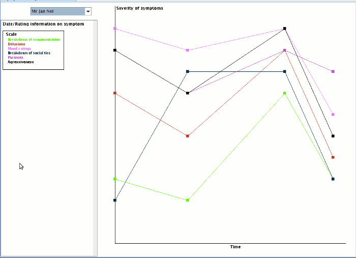
On selection of the patient the chart is automatically generated. There are no x or y coordinates listed due to fear of cluttering. This chart however is color coded to highlight the different symptoms. The scale is located in the left panel below the patient drop down list.
See figure 3

figure 3
Step 3:
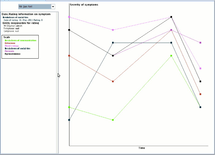
If you click on one of the points in the chart, the panel to the left of the chart, below the drop down list shows the user all the information on that rating. Including who did it with contact detail for that person.
See figure 4

figure 4
Step 4:
If you right click on one of the points in the chart there is a popup menu that allows the user to see the notes on that symptom.
See figure 5

figure 5
