Medisis
DSM Composition chart
The DSM composition chart is supposed to give the physician an idea of the composition of a diagnosis in terms of the four axis of the DSM chart. The DSM document speaks of five axis. This makes that document incorrect from a mathematical view. This is because the fifth axis (Global assesment of functioning) or GAF value would be a linear combination or "expression" of the other four axis. Looking at the chart it is seen that there are only three axis. This idea isn't to produce extra work for a complete picture. It is due to the world around us. Our brains function in a three dimensional world (length,breath and height). It doesn't understand anything more than that. Take the physics fourth dimension, time. What does it look like. How do you relate it to the other three. When trying to do this you see that it is impossible. The idea here is similar.
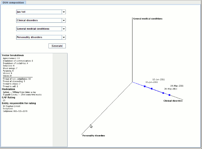
To interpret this chart there are two main things you have to notice. Firstly any rating in the chart is represented by a line, the line has a magnitude, which represents how sever the symptoms are presented by the patient, and it has a direction. The direction shows what types of symptoms were used in the diagnosis for instance if only clinical disorders were used in the diagnosis then the line would be parallel to the "clinical disorders" axis.
Follow the steps below to generate the chart
Step 1:
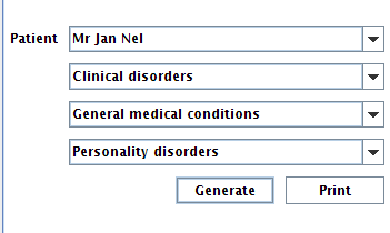
Select the patients name from the drop down list to the left of the screen and select all three axis that are needed to represent the diagnosis. Remember they need to be three different axis.
See figure 1
When the generate button is clicked the application askes you for an admittance period.
See figure 2

figure 1

figure 2
Step 2:
Rotate the chart to the desired position for best viewing by pointing your mouse over it and rolling the wheel towards or away from you.
See figure 3

figure 3
Step 3:
If you click on one of the points in the chart, the panel to the left of the chart, below the drop down list shows the user all the information on that rating. Including who did it with contact detail for that person.
See figure 4

figure 4
Step 4:
If you right click on one of the points in the chart there is a popup menu that allows the user to see the notes on that rating.
See figure 5

figure 5
